A Week of hugs
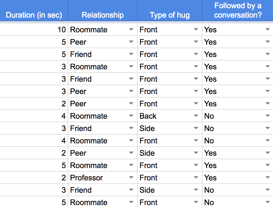
The aim of this two week project was to collect a week long data on a specific behavioral theme and visualize the same by synthesizing the data inventory. It was long that I realized that I have a tendency to hug people. Give them warm hugs to greet or just simply use it as a gesture of appreciation. Hugs make us feel safe, they calm our nervous system and boosts positive emotions. They are also a way to appreciate someone. In an attempt to quantify a behavior, here of hugging people, I collected data for a span of 12 hrs for 7 days in a row to find patterns and effectively communicate the findings through a poster.
Skillsets Used: Information Architecture, Communication Design, Sense-making of quantitative data
How can i quantify hugs?
How many people do I hug in a day?
Who do I hug each day?
What do they mean to me? Am I close to them? --- Roommates? Friends? Peers?
Do I hug strangers when I greet them? Should I be hugging strangers?
Do I hug them for too long? --- long hugs or short hugs?
Is it even appropriate to them? Do I speak to them after?
I found myself asking way too many questions about a behavior as simple as a hug. Until this project, I never imagined giving so much thought into quantifying a hug into so many different parameters. I needed to answer these questions and many more through the synthesis of this metadata.
Final Iteration
DATA COLLECTION
The week long data was collected using Google Sheets which was more accessible to me at any time of the day through laptop or a smartphone. The process revealed plenty of facts about me and gave me an opportunity to look at my behavior different. I updated the database after each hug or if I hugged a number of people one after the other, then I would quickly make a note of it and update my database later on.
UNEXPECTED FINDINGS
Some of the findings from this discourse that helped me visualize - I hugged my roommates the most and they were generally not followed by conversations. Most of the hugs with them would be in the morning or the night, a time when all of us are together at home. I usually just greet strangers verbally. School and home were the most popular places to hug people. I could differentiate between the closeness to a person vs the hug I gave/received from them. I never imagined uncovering these facts through an exercise as simple as this.
CONCEPT ITERATIONS & DEVELOPMENT
After synthesizing the data, I could reveal my relationship dynamics with different sets of people around me. All these insights helped me in my first set of iterations. I chose a metaphor of infinity to describe a perfect front hug. I gave each symbol a name (name of the person) while I chose to represent the top 15 people in my visual. I used two colors to depict gender and deviations from the centre as a way to represent side and back hugs. The circles on the symbols represented the number of times they were hugged (corresponding to the time of the day) while the size of the circle represented the duration of the hug.
I used the space effectively to leave enough negative space to balance the various graphical elements around the poster.
Concept Development
REFLECTIONS
As designers, we often find ourselves being stuck in using the best way to share findings with the stakeholders. This calls for a need to effectively use visual skills. The book, “How Posters Work” by Ellen Lupton, undoubtedly inspired my final design principles. I particularly ended up using the principles of double the meaning, amplify and make a system cohesively to produce the final poster. Not until the end, I realized how subconsciously I used the colors that attract me the most and ended up with a metaphor that closely resembled the Service Design Network logo. The poster is a clear reflection of my personality, thinking, and discourse as a designer.


